Sometimes the story behind a painting is more important than the art itself. This painting had a long journey. It all began when a friend and I went to see an installation of Dale Chihuly’s glass. I had never seen it up close, but when I did, I became thoroughly mesmerized by the shapes and colors. Along with the glass pieces were framed watercolor paintings by Dale. It struck me that such a great artist in glass art was so poor in painting. I bought a pack of his cards as reference.
I thought and thought of how I could interpret his glass into a two-dimensional painting. My first attempt took 10 years to complete. Along with my parents’ health problems and death, I was confounded as how to painting the thing. I got part of “Dear Mr. Chihuly” completed, but I did not know how to take the next step. I did figure out I had made a huge mistake and proceeded to wash off the whole area to start again. The composition was wrong, but I wanted to finish the painting to learn from it and put it behind me.
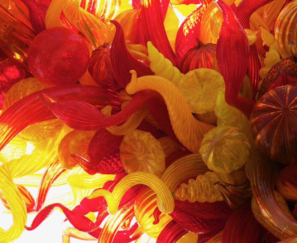
I still wanted to do another interpretation of the Chihuly glass. This time I went to the Phoenix Desert Botanical Gardens to see another Chihuly installation. I had my camera with me this time to capture these designs for future reference. I saw a huge grouping of glass shapes hung high above the entrance to garden trail. The sun was high and illuminated the glass pieces from behind.
After going home, I loaded the photos onto my computer to check what I had photographed. Although there were many favorites, that huge suspended group of glass held my greatest interest. How do I paint this glass? I love puzzles, and had to really think this through.
I started by printing off the photo as large as my printer would allow, 13” by 19.” I wanted to see what it would look like on paper. This also allowed me to decide what part should be cropped or changed. Artists working from a photograph are too often very literal in their rendering. A photo might be great, but have many compositional flaws for a painting. Next, I had to figure out if I was going to give the piece a back-lit look. I realized that if I did this, I would have two light sources: a light source that comes from the back as well as the front. To simplify things, I made the light source come from the front only, making the back lit area black. All my early training on a light source came into play. Light comes forward as shading and dark recedes, to show dimension.
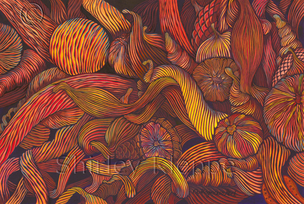
With a few more ideas, I projected the image onto a stretched piece of 140# Arches cold pressed watercolor paper, 15” by 22.” I use a mechanical pencil to sketch the image. Afterwards, I corrected the image on the paper. I use Winsor Newton transparent watercolors for pigments, and Winsor Newton permanent white designer gouache for lighter opaque lines. The dark lines and background are Winsor Dioxazine Violet, so dark that it can look black. I also use Winsor Newton, Series 7, finest Sable brushes for painting. I always start in the upper left-hand corner and work across the top to the right and down. That is where I knew what I was doing, stopped. I worked each shape separately, hoping I could get a handle on what to do next. I struggled and struggled with how I was going to paint this problem. I wanted to use beautiful line work, from light to thick lines with delicate brush pressure, to form the painting’s core interest. I listened to the painting hoping it would tell me what it was. I reworked many shapes to get the continuity going. I had no one to look to for guidance or reference. I was very lost. I stopped working on the painting and left it on the easel in my studio. It yelled at me every day. I was afraid I could never finish it.
Another summer came and we went back to our summer home on the Lake of the Ozarks in south central Missouri. This home is my ‘safe zone’ for working. I have a small studio in the basement area that opens out on the lawn and patio. I brought the painting and painting gear with me. It was time to get down to brass tacks with this beast.
Every day I got myself to sit down and work slowly on the painting. By this time, I had named it, “What A Riot!” I should have taken the “Riot” out and put in “Headache!” Every day things got better. I was actually starting to understand what I was doing. I was enjoying it! I would go back to older areas and do adjustments often. I finally finished the painting, and did an over all adjustment for corrections. I take photos with my iPad of the work in progress, as those images can be reviewed from a different perspective. I can see the corrections to do much easier than just standing in front of the painting.
After all the picking around on the painting, I had to stop. Signed the painting: Outrageous Red
Now for the good news. Just like a horse in his first race to see what he will do, I entered “Riot” in the “Pennsylvania Watercolor Society International Juried Exhibition 2016”. The rules were very stiff, as are many watercolor exhibitions. With a strong painting, it’s first juried show has to be big with good prize money awards. The cost of entering and shipping alone needs to be offset with an award, preferably cash. Well, folks, “What A Riot!” won the $200 Dick Blick Award!! That really makes me happy and confirms that my approach to linear painting has merit. If the painting had not been accepted, I would have seriously rethink about doing anymore linear paintings. I will continue to do more in this style.
P.S. This painting is an interpretation of linear art taken to the next level with the fusion of painterly art.